How We Made Assurity’s Website Awesome!
The old site, although functional, was built five or so years ago now and was beginning to fall behind in terms of supporting modern devices, which we all know from Man's latest blog post, is essential these days to rank well on Google.
So how did we make it so fantastic I hear you ask? Well, lemme break it down for you now.
Google likes modern, fast, easy to use websites, so in a nutshell, that was what we set out to achieve.
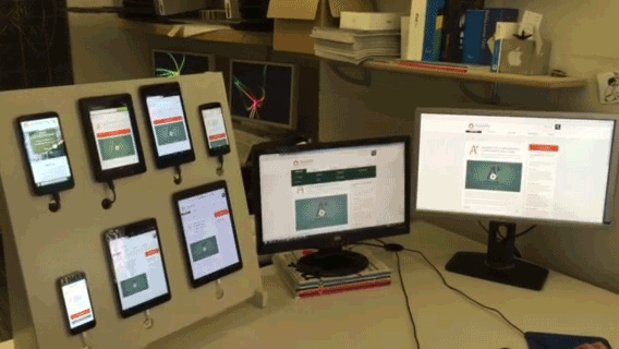
Now a modern website doesn't just mean it looks fresh and up to date, it has to work fresh and up to date as well, and to achieve this we employed our super sexy testing dock (shown to the right) to ensure that it worked super sexy across a range of mobile and tablet devices.
To keep things speedy we implemented all kinds of technical server jazz - compressed, optimised and cached all the static assets that we could get our hands on and combined and compressed the dynamic assets into single files to reduce all those unruly HTTP requests to the server. Yummy.
The design of the site also plays a big part on how well a website scores in the Google's page ranking system too so we made sure to stick to guidelines on button sizes (for people with chubby fingers), font sizes (for people with tiny eyes), and even colour guidelines (for the white and gold-ers of the world).
The results of our hard work? Well, let’s just say, it’s pretty amazing.
Go see for yourself batman.
Let’s kickstart the conversation
We can help you with your next project. Get in touch with the team today to get the ball rolling.
You may also like...
More from the blog


Tea break sized updates and news direct to your inbox.
By signing up you agree to receive communications from us in line with our privacy policy